The Problem
Neighbors want to feel connected. Almost nothing gives them a second reason to meet.
Interaction rarely goes past a passing greeting in the hallway. Events are one-offs, and activities that ask for real commitment filter out everyone only mildly curious. Familiarity is a function of repeat exposure, and neither format repeats.
Existing neighborhood apps post the notice, fill the inbox, and stop there. Meanwhile every one of these buildings already owns a court, a garden plot, a calm room, a pool, all paid for and sitting empty. The gap is coordination, so that is where I aimed the work.
The bet. Use shared community facilities and the light structure of a recurring league to give neighbors a reason to keep showing up to the same group. Connection is the goal. Competition is the scaffolding that makes showing up feel casual.
Leading the Work
Three people, three scenarios, one unifying output.
The buyer is a residential management company. The user is someone judging the app in thirty seconds while standing in a lobby. I owned that outcome end to end, and set the standard every layer had to meet before I called it done.
Seven weeks, three phases, something demo-able at the end of each. Parallel tracks drift, so the schedule forced convergence before high fidelity.
Weeks 1–2 · Research
Frame the problem
- Design brief and success criteria
- Generative research, 5 residents
- Synthesis, insights, personas
Weeks 3–5 · Design
Build the thing
- Sitemap and three wireflows
- Low-fidelity wireframes
- Mid-fidelity interactive prototype
Weeks 6–7 · Validate
Test, then unify
- Moderated usability study, 4 residents
- Design system and accessibility audit
- High-fidelity iteration
How the work was run
Deliverables lived on a board with dates and per-card acceptance criteria, so "done" was agreed before the work started. The same habit is why the design system was written as a spec.
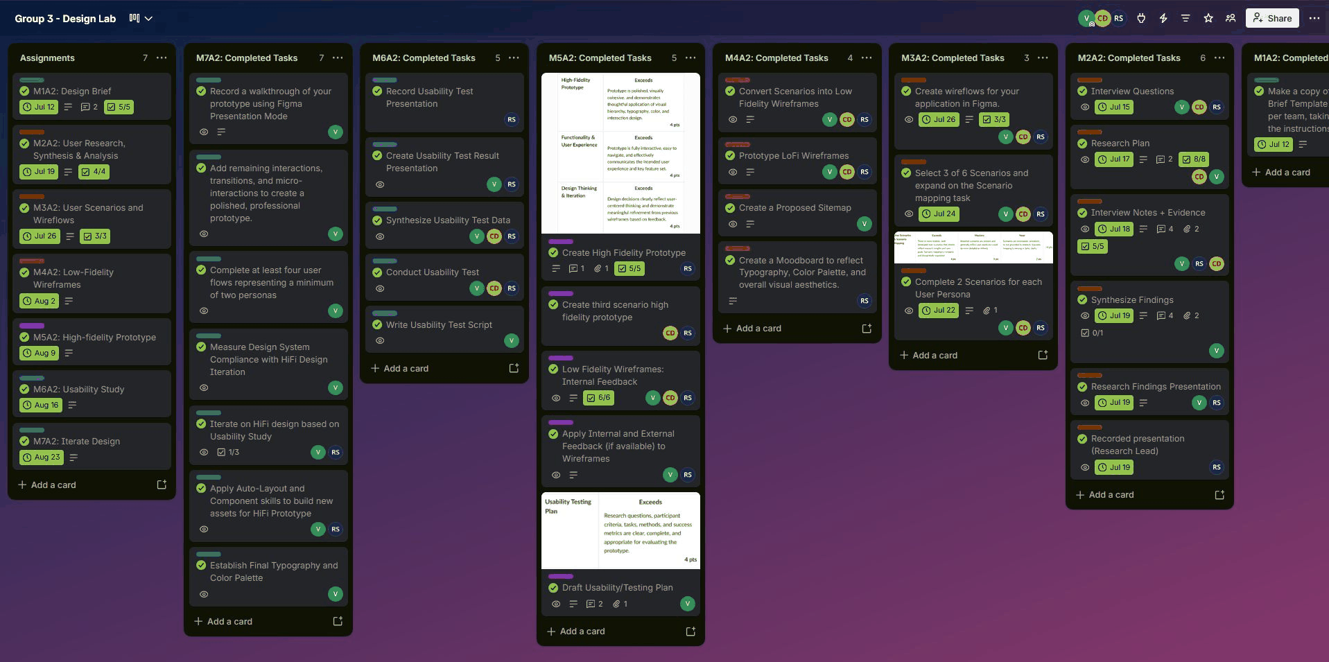
Delivery board — dated milestones with acceptance criteria attached to each card
Discovery Research
Four things five residents kept telling me.
Communication breakdowns prevent participation
People were not opting out. They were finding out too late, because notices lived in email.
Collaborative spaces already exist, and sit unused
Courts, gardens, calm rooms. The buildings had already paid for the infrastructure. Nothing was scheduling it.
Newcomers lack a clear path into established communities
Groups that had already formed read as closed from the outside, even when nobody intended them to be. There was no visible door.
Relationships form through repeated, low-pressure interactions
The relationships participants valued came from bumping into the same people on a schedule. This is the insight the whole product is built on.
Objectives, method & recommendations
Five research objectives set before any screen was drawn: how residents currently participate, what prevents them, what motivates contribution, what makes them feel connected, and how newcomers and long-term residents experience the same community differently.
Sessions were recorded with consent, transcribed, and mapped back to the interview questions in FigJam. I used Figma AI for the first affinity pass, which produced ten candidate clusters in minutes, then reviewed every cluster against the transcripts by hand and moved the notes the model had filed by keyword rather than by meaning.
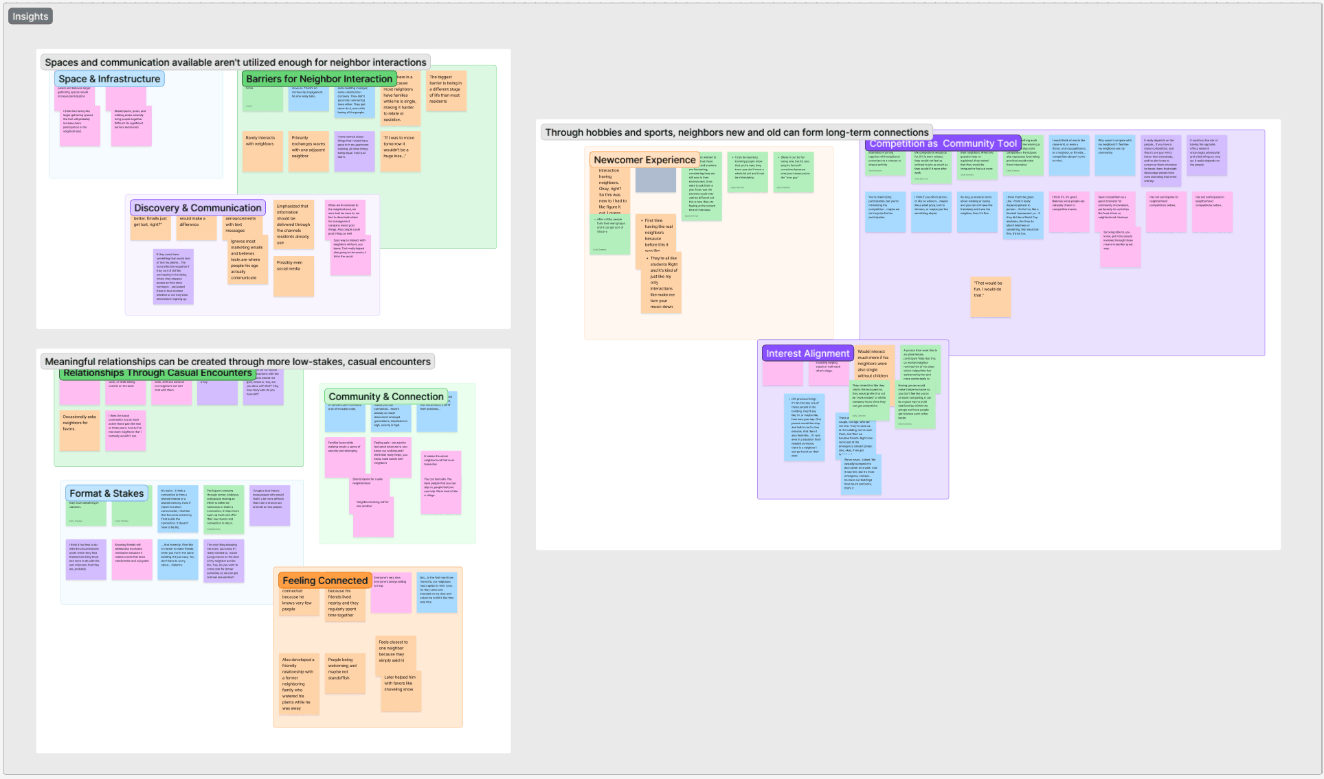
Affinity clusters — ten clusters rolled up into the three statements that framed the design
Recommendation 01
Notify on text, push, or in-app, never email
Three of five participants rejected email outright and named text as the alternative they wanted.
Recommendation 02
Make the competitive framing adjustable
Two participants pushed back on competition and three were drawn to it. A dial from "just show up" to "keep score" serves both.
Recommendation 03
Hold a predictable, low-commitment cadence
Recurring weekday evenings beat one-off events, because a fixed slot is something a resident can plan around.
Recommendation 04
Let residents opt into interest-tagged groups
A single generic league appeals to a slice of a building. Several small ones give more people something to say yes to.
Personas
Two residents, two different reasons the current system fails them.
The interviews split cleanly along tenure. One group could not find a way in. The other had found one, tried, and kept missing things. Both are participation failures, and each needs a different fix.

Persona 01
The New Arrival
"I recently moved into a residential community and feel like an outsider due to already formed groups. I want to connect with my community, but I need an easy way to find opportunities and feel comfortable joining."
Needs a visible, low-pressure way into an existing recurring group. Fears showing up alone to a room that already knows each other.
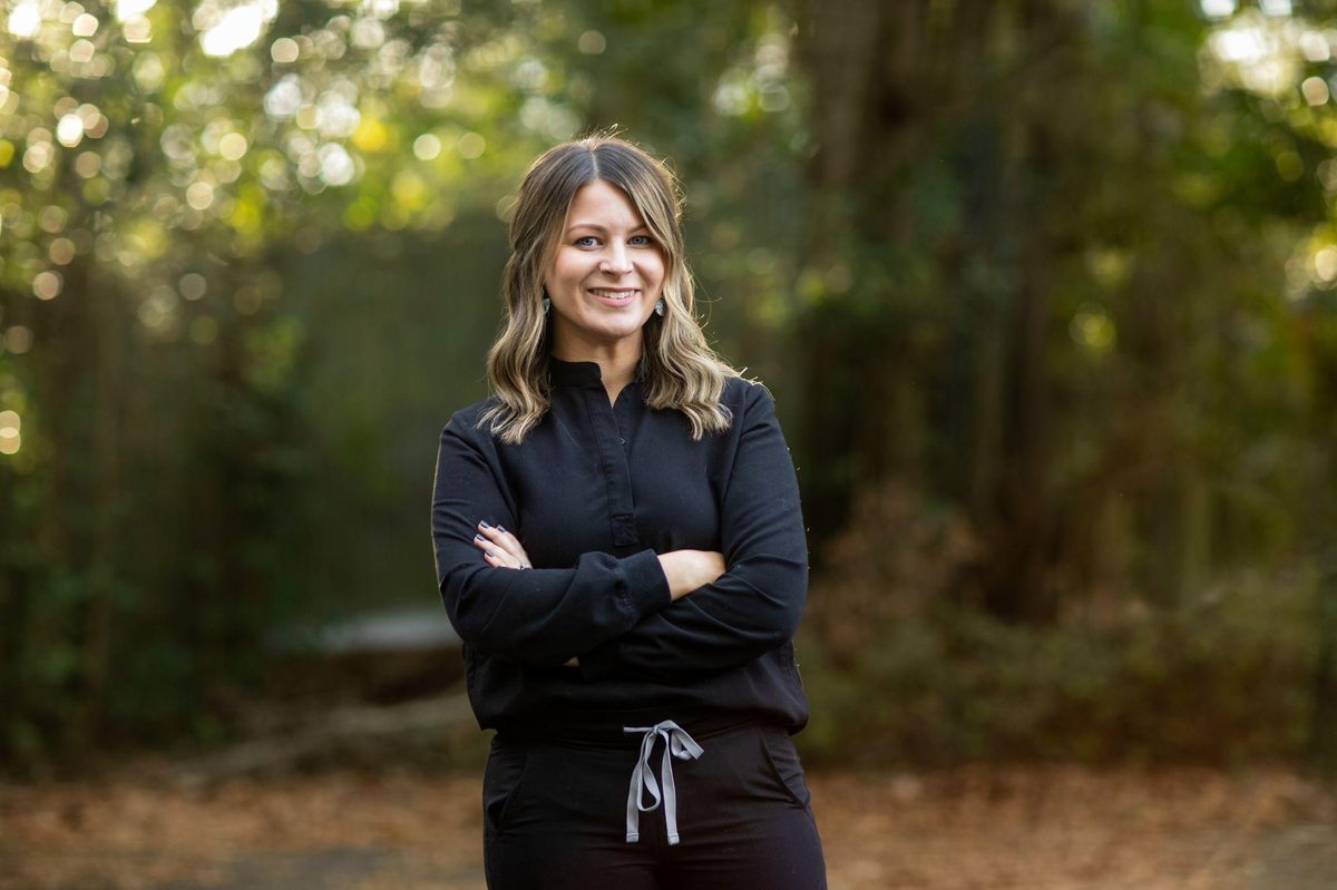
Persona 02
The Untapped Resident
"I'm not opposed to connecting with my neighbors, in fact, I've actively tried. But I keep missing opportunities because I never know when something is happening."
Needs reliable, low-effort notification and confirmation that events actually happen. Fears another season of finding out afterward.
Wireflows
Three scenarios, drawn before a single screen was styled.
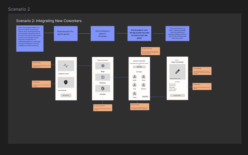
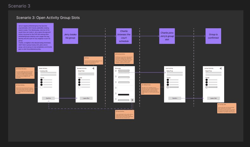
Three scenarios so the team could work in parallel without colliding, each wireflowed end to end first. Decisions were annotated on the flow itself, so the reasoning stayed attached to the screen it belonged to.
The Untapped Resident attends an event, scans in, and sees their check-in roll up into a community goal. This is the loop that turns one attendance into a reason to come back.
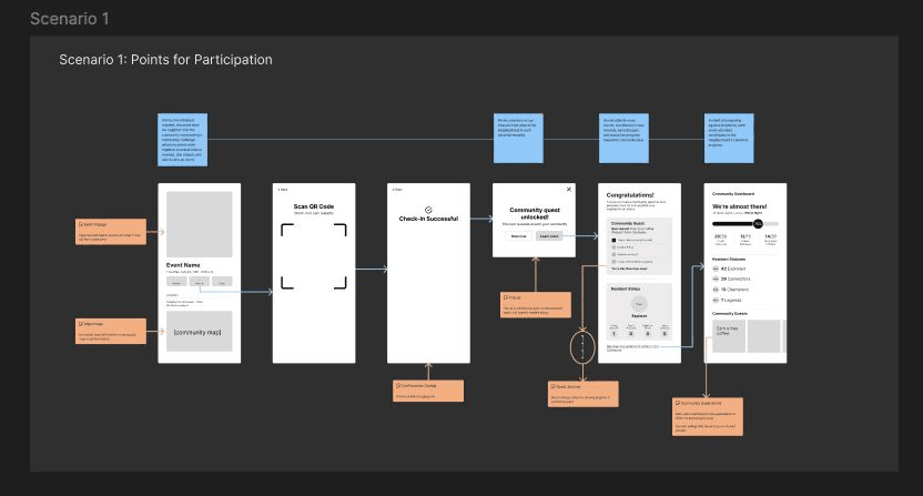
The Untapped Resident hosts. Choosing an amenity, setting a time, and opening the invite to the building turns a private plan into a public one.
The New Arrival browses what is already scheduled, finds a group with open slots, and joins without having to ask anyone for permission.
Product Architecture
Underneath the friendly part, this is a scheduling system.
Neighbo books shared property on a fixed calendar, tracks attendance, and awards credit a management company eventually pays out. Capacity, overlap, invite scope, cancellation, check-in windows, and scoring eligibility all have to resolve correctly, or a resident shows up to a court someone else is already using.
Residents will not tolerate a scheduling interface. So I worked each rule down until an affordance could carry it, which is also what keeps the build small: every rule resolves to a state on an existing component, never a new screen.
The rule
Capacity and conflict. Each amenity has a fixed capacity and a bookable time grid. An activity cannot exceed capacity or overlap another booking on the same amenity.
How it surfaces
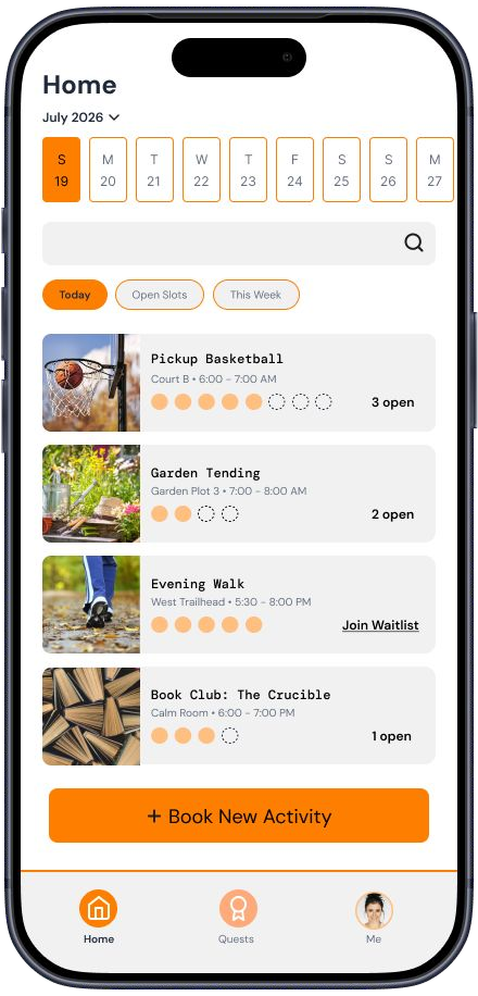
One number on the row: 2 open. No calendar arithmetic, no conflict modal. A full activity swaps that same slot for Join Waitlist, so availability and its fallback hold the same position in the layout.
The rule
Release on empty. An activity that loses its last participant releases the amenity back to the building, so leaving a group you created can destroy a booking others were watching.
How it surfaces
Stated inline under Leave Activity: "Cancels activity if all slots are empty." The consequence is disclosed on the control that causes it, at the moment it could bite.
The other four rules
The rule
Invite scope. A host decides whether an activity is private to invited neighbors or discoverable by the whole building. Everything downstream depends on that flag.
How it surfaces
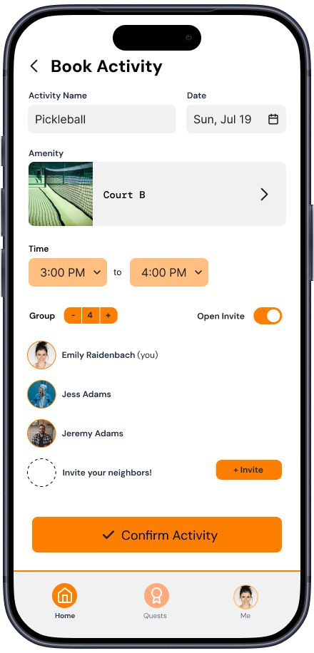
A single Open Invite toggle placed beside the invite list, so the choice is read in the context it governs, with no settings screen to bury it in.
The rule
Attendance, not intent. Booking earns nothing. Credit is issued only when a resident checks in during the activity window, which stops the system rewarding people who sign up and never appear.
How it surfaces
Check-in becomes the primary action only inside its window, and the row advances from Booked to Joined to Checked in. The rule is expressed by what is tappable and what the badge says.
The rule
Not all participation scores. Daily questions exist to give a lurker a zero-risk first interaction and deliberately earn no credit, while community quests advance the building goal.
How it surfaces
Every quest row carries its tier as a label, and the daily one states its own exclusion plainly: "doesn't count toward quests or the community goal." Nobody has to reverse-engineer the scoring to trust it.
The rule
The goal is collective and funded. Check-ins, status upgrades, and completed quests aggregate across every resident toward a reward the HOA pays for, on a deadline.
How it surfaces
Building-wide totals sit in a labeled Community Goal card naming the reward, the funder, and the days left, with "your contribution so far" as one quiet line beneath. Testing made this the most demanded fix on the page.
The bet inside the bet. Community apps reach for leaderboards, and leaderboards rank neighbors against each other, which is the opposite of the outcome. A building-wide, HOA-funded goal points the same mechanic at a shared target, gives a management company something concrete to sponsor, and keeps a resident who contributed one check-in visibly part of it.
Mid-Fidelity & Usability Testing
Built it gray, then put it in front of people.
Deliberately unfinished: real structure, real copy, no visual polish worth defending. That keeps a usability session about whether the flow works instead of whether the orange is right.
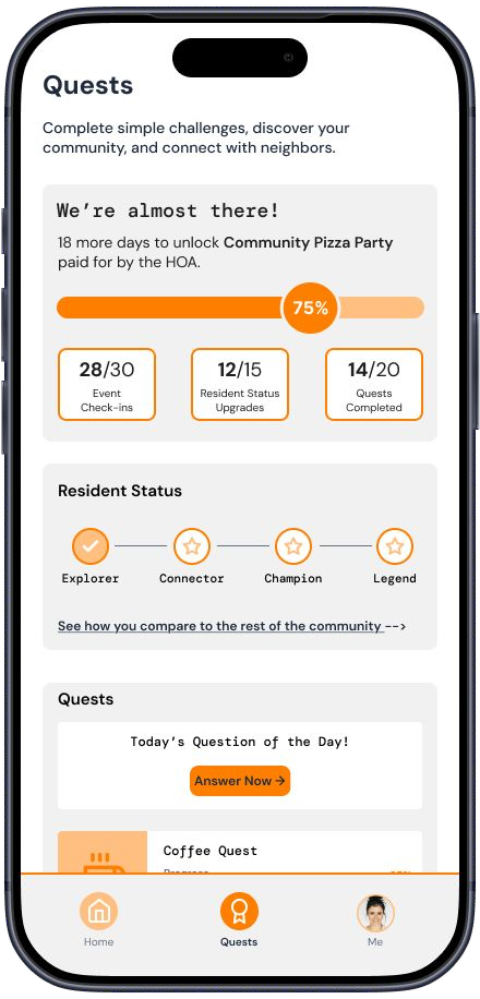
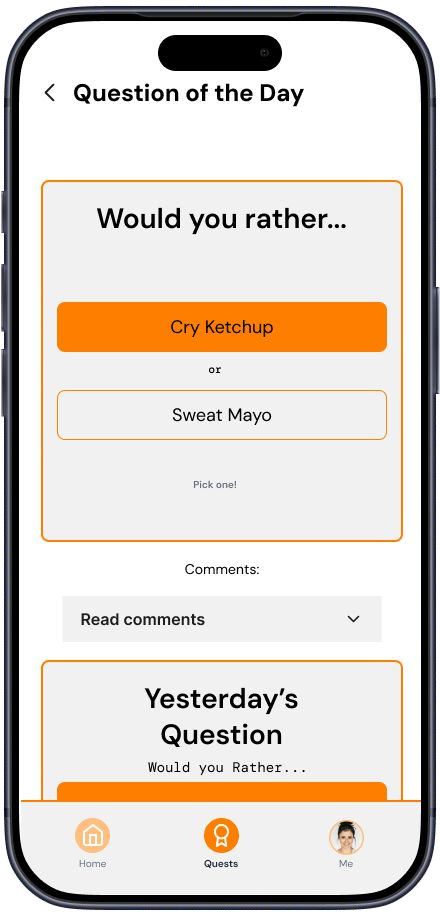
Moderated usability study
The Home page connects people to activities, and asks too much of them
They found what they were looking for and worked for it. The list was chronological rather than relevant, and the filters too blunt to narrow a busy day.
Booking works; the confirmation leaves next steps uncertain
People booked and joined without hesitation, then paused. Nothing told them what state they were in, or where the thing they joined had gone.
Quests land emotionally, and the mechanics do not read
They liked the idea immediately, and could not tell which numbers were theirs, which were the building's, or what any of it unlocked.
Visual Direction
Choosing the look, and being able to defend it.
A design system enforces consistency and says nothing about whether the thing is any good. These are the four decisions the system exists to protect.
The palette · 11 tokens
The type ramp · 5 styles
The Design System
The fix for three parallel tracks was one shared vocabulary.
Going into high fidelity, three scenarios designed by three people used four grays, three corner radii, and two ideas of what a primary button looked like. The product read as three products. I spent the iteration cycle on the system instead of more screens, and made three decisions specifically to keep the build cheap.
Accessibility, checked before anything was called done
Every screen passed a WCAG 2.1 AA review before it was called done: contrast, touch target size, focus and state visibility, and whether meaning survived without color. I ran it against the live Figma file through the Figma MCP server, checking bound values on each layer rather than eyeballing a screenshot. Two findings changed the design.
What the audit changed, and the spacing scale
The mid-fidelity orange failed contrast on white for small text, so orange became a fill and structural accent while text moved to warm-gray/text-primary. And activity status, carried by color alone, picked up a text label so "Joined," "Booked," and "Checked in" read without it.
Spacing & radius · 9 tokens
The handoff that follows is short: a variant matrix, the states already drawn, and the six rules written as conditions.
Design Iteration
Four changes, each traceable to a finding.
Response to Finding 01
Home leads with relevance
A "Suggested for You" shelf floats activities matched to a resident's interests above the chronological list, and the filter row gained amenity, day, and time.
Response to Finding 02
My Activities, with explicit status
Anything created or joined lands in a dedicated Activities tab, each row carrying its state. A banner answers "did that work" and the tab answers "where did it go."
Response to Finding 03
Quests separates yours from everyone's
The community goal moved into its own labeled card stating the reward, the deadline, and that the numbers are building-wide, with a personal contribution line underneath. Quest tiers are now visually distinct.
Response to Findings 01 + 02
Three tabs instead of two
Splitting Activities out of Home gave every state a place to live, and gave the nav a shape matching how participants described the app back to me.
Final Design
What shipped at the end of week seven.
Five screens carry the loop: find something happening, create or join it, track what you committed to, and see the building move toward something together.
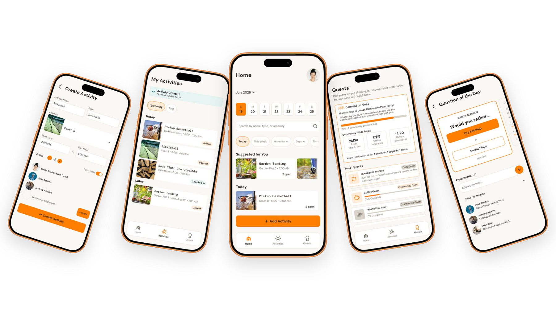
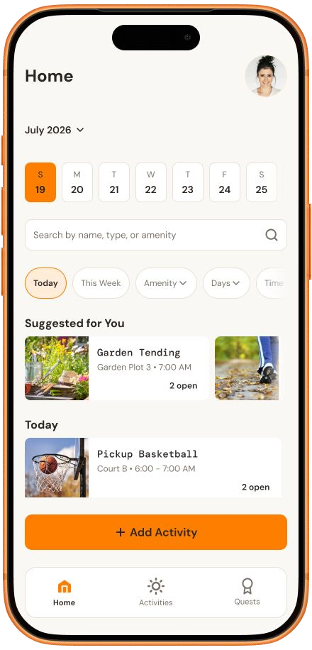
Home — suggestions above the schedule
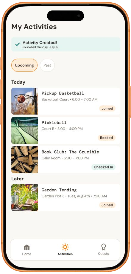
My Activities — status on every row
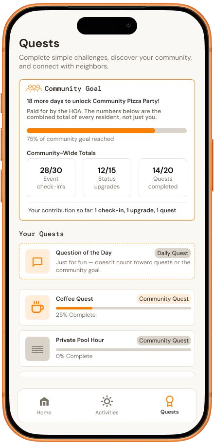
Quests — community goal split from your quests
What I Learned
Five things I took out of leading this.
Parallel work needs a system before it needs more screens. The week on tokens bought back more than it cost, and I would now build that scaffolding at mid-fidelity rather than after testing.
A mechanic can carry a product past where the research supports it. Competition tested well with three of five and poorly with two. Pointing it at a shared goal and leaving the stakes adjustable was the honest answer; declaring competition the mechanic would have been the convenient one.
Liking something and understanding it are separate tests. Every participant liked Quests on sight and none could explain how it worked. I now separate those two questions explicitly in my scripts.
Craft is a business argument. A photograph in every row makes the product better, makes the build heavier, and commits the client to maintaining images forever. I made that trade knowingly, and could say what it bought and what it cost.
AI output still has to be checked line by line. Figma AI clustered five transcripts in minutes and grouped several notes by vocabulary rather than meaning. The review is what turned the output into research.
What's Next