The Problem
While Google Maps optimizes routes, it doesn't account for preferences.
This started on a drive home with my dad. Every time we'd head back, we'd open Maps, set the destination, and ignore it almost immediately. We already knew how we wanted to get there, but couldn't access the relevant traffic info. Maps would then spend the whole trip telling us to turn where we didn't want to, rerouting us onto roads we had no interest in taking. It knew where we were going. It had no idea how we wanted to get there.
That's what kicked off this idea.
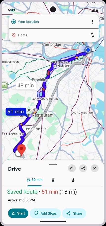
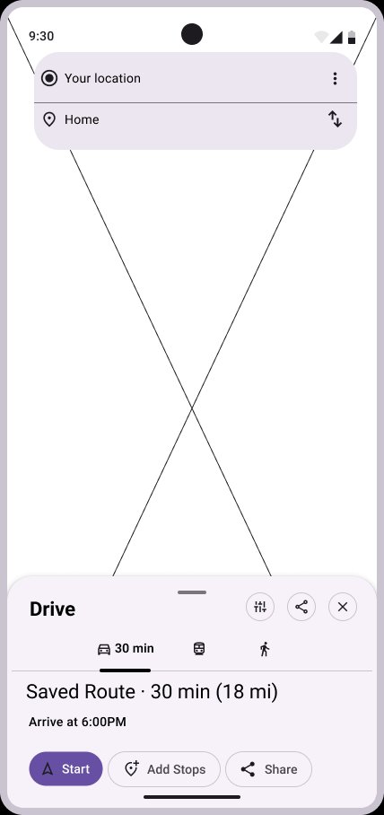
This project explores a single addition: the ability to save a preferred route and have it surfaced automatically on future trips to the same destination.
Proto-Personas
Two Drivers, two goals.
Without access to formal user research, I built proto-personas from behaviors I've personally observed. Jay came directly from driving with my dad. Rachel came from watching friends navigate for others.

Proto-Persona 01
Jay, The Work Commuter
"I want to be guided on a safe and familiar road, so I can be comfortable driving at night."
Proto-Persona 02
Rachel, The Ride-Giving Driver
"I want to save personal routes, so I can navigate with my preferences."
Design Process
Lo-fi to hi-fi, tested twice.
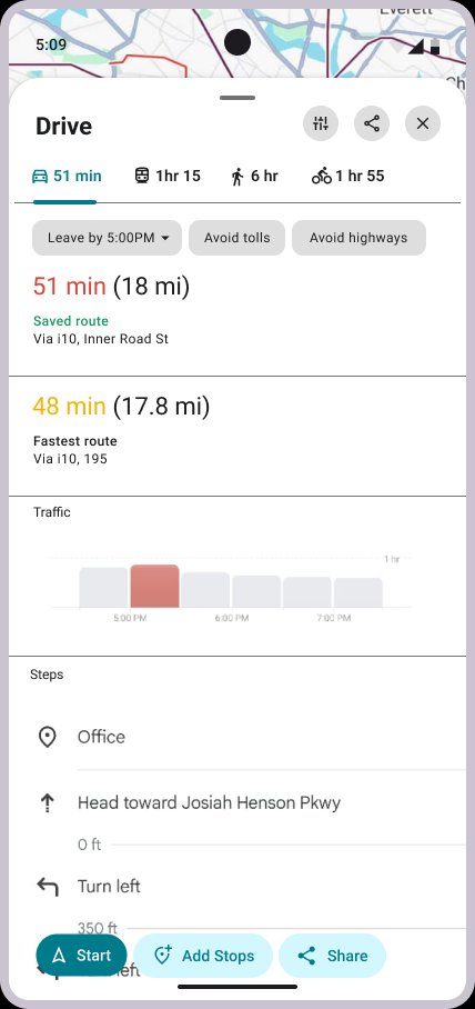
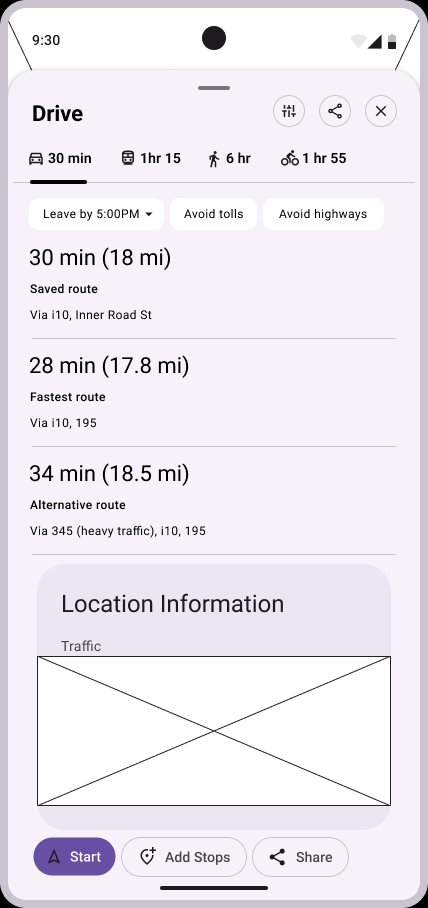
Starting from sketches, I moved through lo-fi wireframes, mid-fidelity mockups, and a usability test before landing on final designs. Floating the user-preferred route first made it through every iteration, above fastest and alternative options. Participants liked this hierarchy.
Both flows in full fidelity — Jay selecting a saved route with weather context, and Rachel saving a preferred route for future trips.
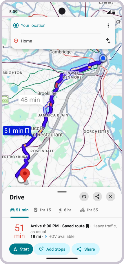
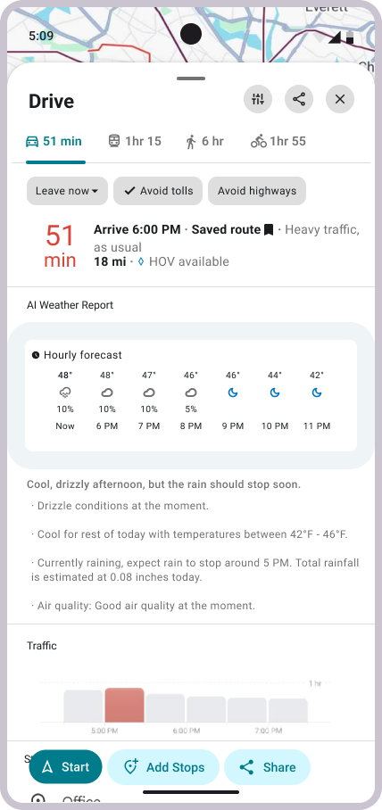

Based on my phone’s version of Google Maps and its design system.
Structure and hierarchy.
Usability Testing
Three things participants kept saying.
After usability testing, three main points came out of my findings:
Users expressed interest in behavior adaptation
Participants wanted Maps to recognize roads they take regularly and surface suggestions automatically, rather than require them to manually save anything.
"You've taken this route 90% of the time."
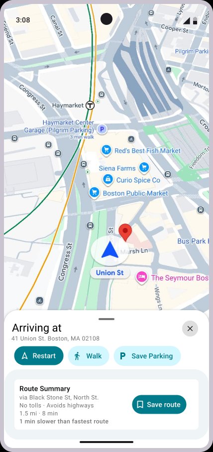
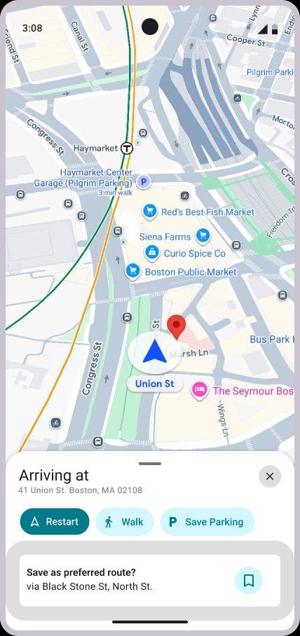
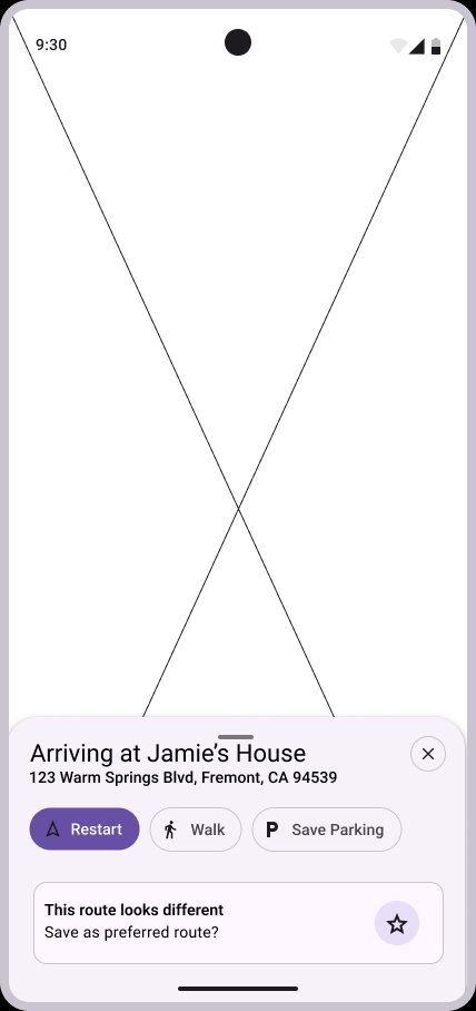
The save prompt didn't inspire attention from users
The arrival prompt wasn't drawing attention. One participant noted it looked "ignorable". The feature needed more presence - people can't use what they don't notice.
"I wouldn't have seen that if you hadn't pointed it out."
More context before committing to a route
Participants wanted to understand conditions before tapping Start. Weather came up unprompted as a specific gap - they wanted to know what they were heading into before committing.
"It would be cool to see what the general weather looks like."
Design Decisions
The two biggest changes between Mid and hi-fi:
Response to Findings 01 + 02
Route Summary panel
Replaced the invisible arrival prompt with a persistent Route Summary card. It solves visibility and answers the "what am I committing to" question at the same time.
Response to Finding 03
Weather widget
Added an AI Weather Report into the route detail panel. It came directly from participant feedback and made the design stronger. But it raised a real question: am I improving the core feature, or chasing adjacent ones? That tension doesn't have a clean answer.
What I Learned
Three things that didn't show up in the brief.
Consistency across devices isn't guaranteed, even in production. Features visible on one device weren't available on another. That made usability testing harder to control.
Designing a live product means your reference is always moving. Google shipped updates throughout this project that changed the design directly. This became a game of cat and mouse between me and the product in the process.
Following user feedback isn't always straightforward. I liked the idea of the weather widget from user input and implemented it. But in retrospect, the solution felt more geared toward helping users make decisions, rather than expressing preferences.
What's Next