How might we create a simple, safe entry point for newcomers to join local sports groups, so they feel comfortable participating without connections?
Duration1 month
RoleResearch, UX Design
TeamSolo
ToolsFigma, FigJam
Outcome
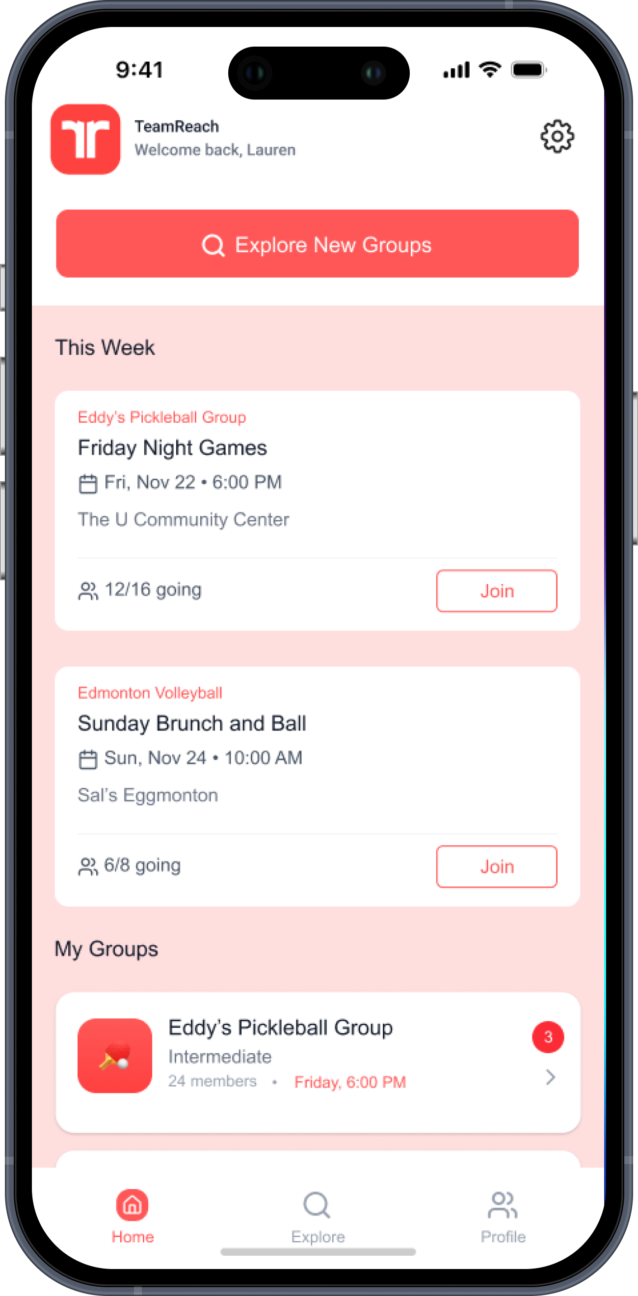
Designed a discovery layer for TeamReach so newcomers can browse public groups, view details, and request to join.
Tested with 6 recreational athletes — visual hierarchy was clear, and the final iteration improved typography and CTAs based on feedback.
The Problem
Private by default
TeamReach is built for groups that already exist. Members coordinate events, share updates, and communicate inside a closed space.
That works well for existing members. For a newcomer looking to join a local rec league, there's no way in: no search, no group details, no entry point.
The task: imagine TeamReach opens up. What does discovery look like for someone who wants to play but doesn't know anyone yet?
Research
Understanding the gap
Before sketching anything, the goal was to understand how recreational players actually find and join groups today, and what makes that process feel comfortable or awkward.
01
Explore how recreational athletes use tools like TeamReach to coordinate games and how those systems could evolve to support newcomers.
02
Understand what motivates recreational players to join, stay in, or leave a sports group.
03
Examine how trust and familiarity shape participation in private versus open communities.
04
Determine how current coordination habits (group codes, text threads) affect accessibility for new players.
Sprint Map — two actors, one goal: Newcomer joins confidently, Organizer approves with confidence
Key Actors
Two sides of the same door
The sprint map surfaced two distinct actors. Each has a different goal, and the design has to serve both.
Actor 01
The Newcomer
Wants to play local sports but has no existing connections to a group. Needs enough information and reassurance to make a confident request.
Wants to play→Researches groups→Evaluates fit→Requests to join→Joins confidently
Actor 02
The Organizer
Manages an existing group and is open to new members, but needs to vet them for skill level, availability, and group fit before approving.
The sprint map converted directly to a user flow, which drove the wireframe structure.
A principles and related worlds exercise (Meetup, Bumble BFF, Uber) shaped early decisions around trust, transparency, and social belonging.
Crazy 8s on the Meetup model served as a productive warmup: forcing rapid, unconventional ideas before any structure was locked in helped break familiar patterns and surface directions that slower methods would have missed.
Added brand colors and real event data to test recognition before user interviews
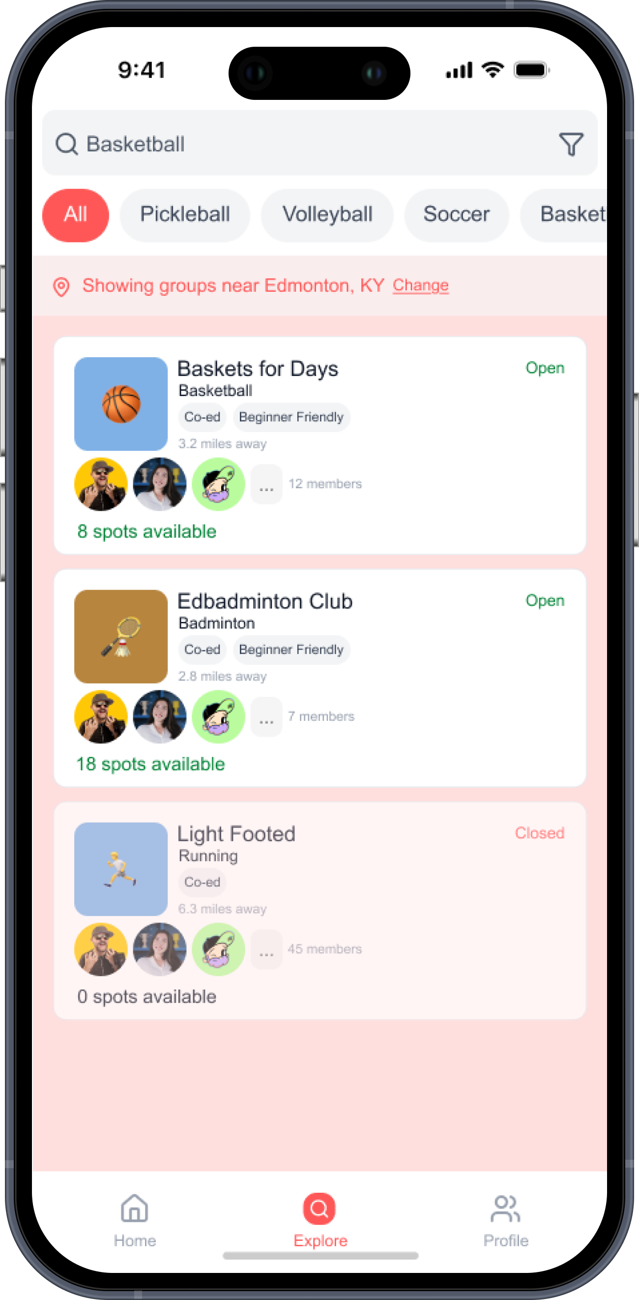
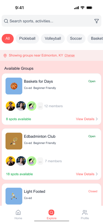
Open/Closed tags and spot counts added after lo-fi showed users needed more context to evaluate a group
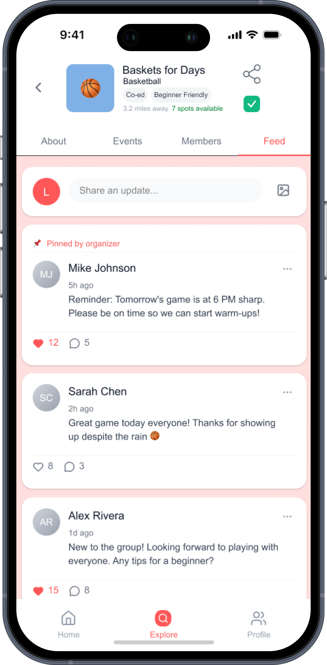
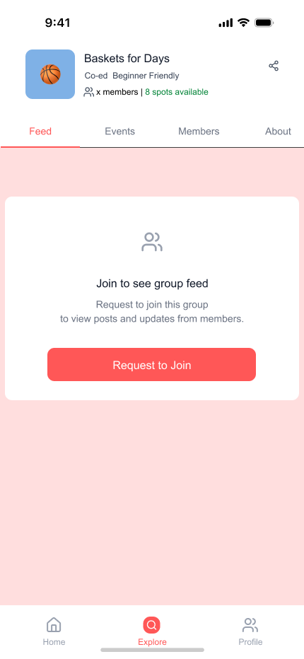
Locked feed: the most discussed decision in testing. Right amount of friction, or a barrier?
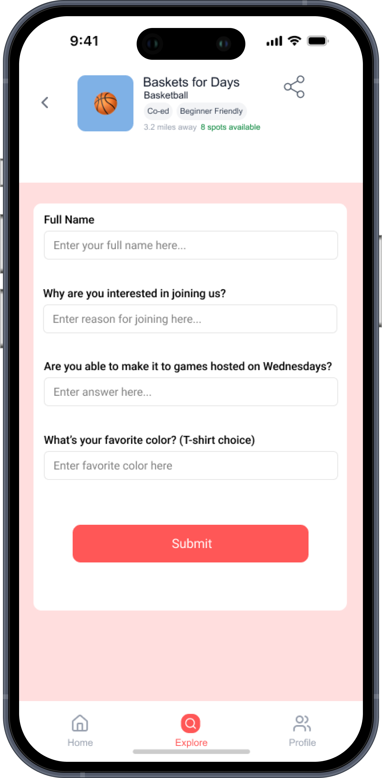
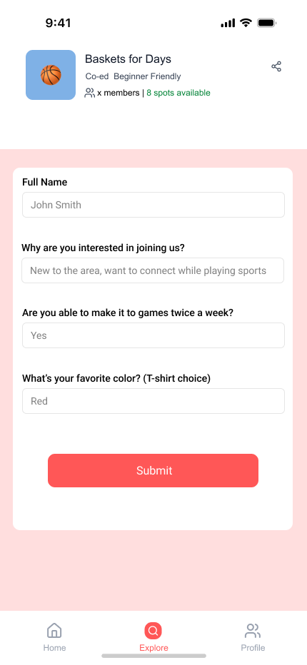
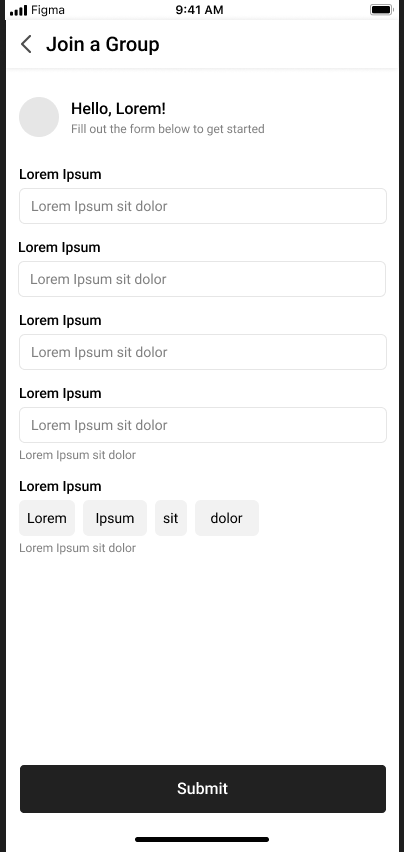
Generic Lorem fields replaced with real organizer questions: availability, interest, skill level, shirt color
Gray wireframes. Focused on structure and flow.
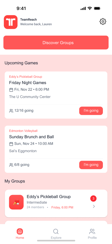
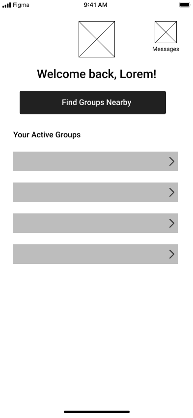
Home: two paths from the start, one for members, one for newcomers
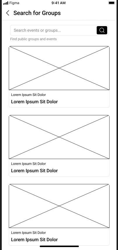
Search: no filters yet, to see if users would ask for them unprompted
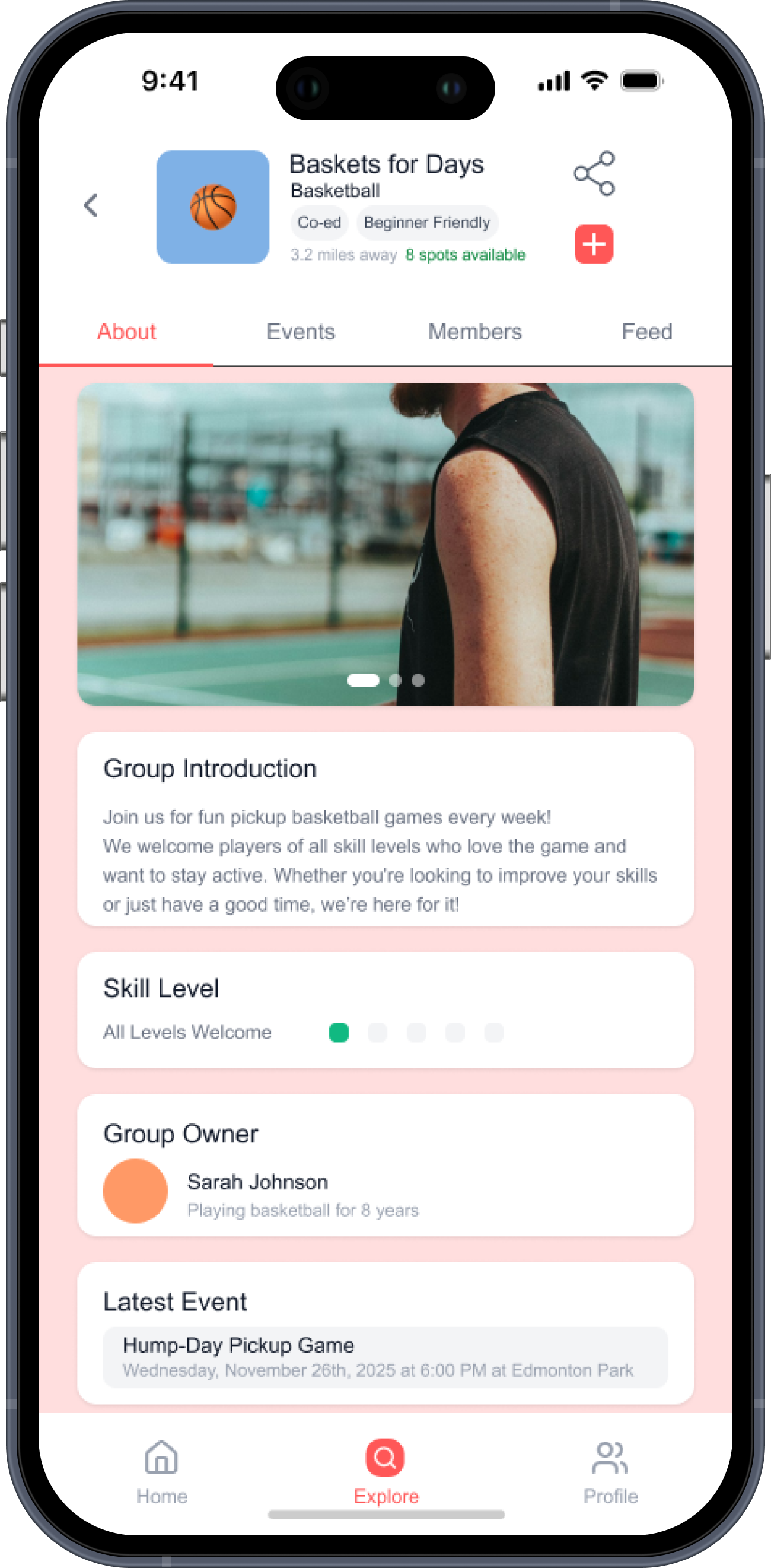
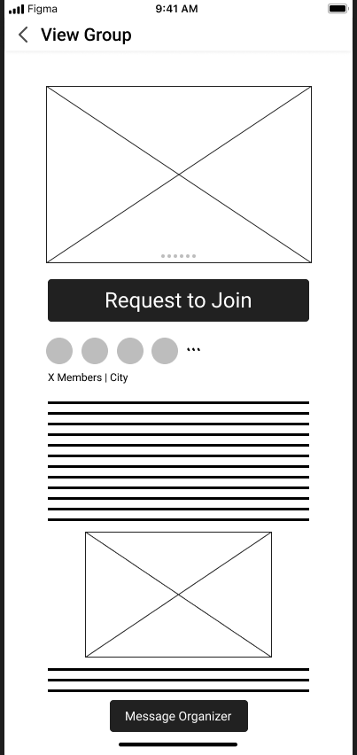
View Group: first question was how much to show a non-member before they commit
Join form: fields left generic to test which questions felt necessary vs. invasive
Usability Findings
What the testing surfaced
Six athletes tested the mid-fi prototype. Two patterns came up consistently across sessions.
01
Visual hierarchy and flow worked, however, typography and CTAs needed work.
The overall layout was clean and easy to follow. Process states were legible.
Where users paused was on CTAs: the labels didn't always match intent, and text size choices made some actions feel secondary when they weren't.
02
The search and group tabs were solid, however, the locked feed created uncertainty.
Finding and browsing groups felt seamless. The sticking point was the View Group screen for non-members: hiding all group content behind a join request left users without enough context to decide if the group was worth joining.
Key Design Decisions
What changed and why
These four changes came directly out of usability feedback.
Navigation
CTA copy revised for intent clarity
"Discover Groups" tested as passive. "Explore New Groups" performed better as a clear action for newcomers on the home screen.
Filtering
Sport filter chips added to search
5 of 6 users asked how to narrow results by sport. Added filter chips at the top of the search screen to make scoping by activity the first interaction.
Information access
About tab as default for non-members
Hiding all group content behind a join prompt removed context that users needed to make the decision. The About tab gives non-members enough to evaluate fit before committing.
Join form
Shorter form, clearer questions
The mid-fi form had 5 fields. Testing showed it felt like too much commitment early in the relationship. Simplified to 4 targeted questions based on what organizers said they actually needed.
Reflections
What I learned
→
Information hierarchy is critical for decision confidence.
Placing the right details early shaped user behavior more than any visual treatment. Users couldn't commit without context.
→
Clarity over elegant interaction.
Simplifying the flow early on meant users could make their decisions sooner.
→
Users always need more context than you assume.
"Minimalism" was my instinct on the group detail screen. Testing showed it as friction, not elegance. Real users need enough to make a call.
What's Next
Future directions
01
Re-test the updated prototype.
Validate that the revised CTAs, filter chips, and About tab default address the usability issues found in round one. Identify what still doesn't land.
02
Introduce social and messaging flows.
Once a newcomer joins, the experience doesn't end. Designing the first-touch messaging flow between a new member and an organizer is the next layer of the problem.