The Housing Tool @ DOJ
As part of a broader modernization effort, I led the design and implementation of several improvements to legacy systems the Department of Justice (DOJ).
Roles:
UX Engineer, Interaction Designer, Front-End Developer
(HTML, JS, CSS)
(HTML, JS, CSS)
The Challenge
Like many legacy government platforms, the original tool had major limitations:
- One record per form, with no overview or batch submission options.
- No filters, shortcuts, or confirmation layer.
- Repetitive workflows without feedback or validation.
- High time cost for high-stakes tasks.
The entire workflow lacked systems thinking. I treated this as a Lean UX opportunity, using live wireframes and early-stage coded prototypes to accelerate iterations under tight deadlines.
Before: Legacy Workflow
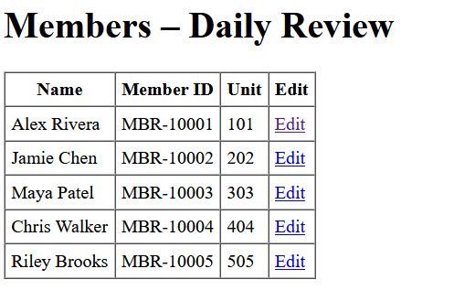
The original workflow required staff to navigate to a separate page for every member record.
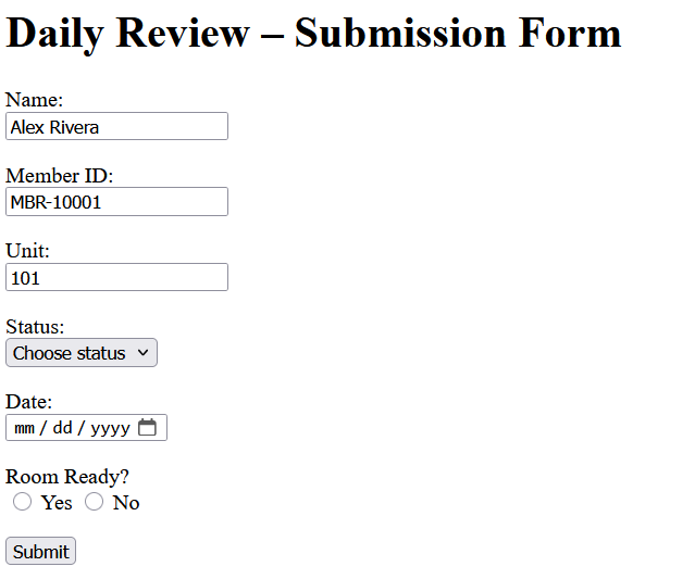
Each submission had to be made one at a time, with no ability to track progress, validate inputs, or filter by parameters.
After: Matrix Workflow
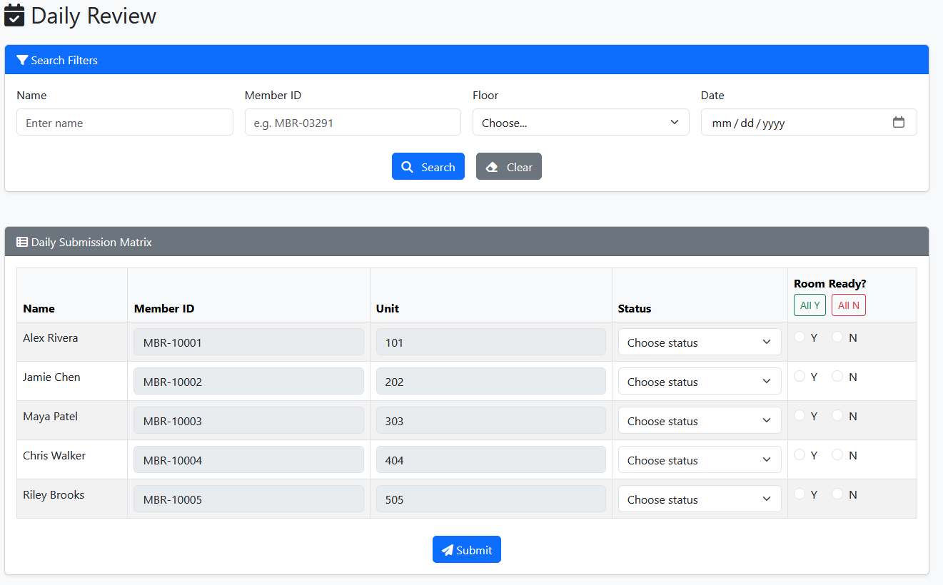
The new interface lets users modify and submit updates across dozens of records in a single view. Features include sortable columns, batch compliance toggles (e.g., “All Yes”), keyboard-accessible fields, and visual validation.
Results & Impact
While formal metrics couldn’t be gathered due to DOJ’s security constraints, I received direct feedback from program managers, users, and development leads. My Chief Developer noted this was the "cleanest solution" he’d seen in his tenure.
From 2 days → 5 minutes
The matrix interface transformed a multi-day effort into a five-minute task, freeing staff time and reducing the risk of error through better defaults and clear structure.
The matrix interface transformed a multi-day effort into a five-minute task, freeing staff time and reducing the risk of error through better defaults and clear structure.
Reflection
This was a rare case where I got to play technologist, designer, and product owner. With no access to analytics, no dedicated designer, and limited time, I leaned into what I knew best: building prototypes in code, gathering feedback through stakeholder demos, and optimizing my work for real-world use.
It was here where I learned that design is iterative and fast: there are always data-backed improvements to make and not enough time to do it all in the first go. That being said, it is a feeling you will get used to in a fast-paced environment!
It was here where I learned that design is iterative and fast: there are always data-backed improvements to make and not enough time to do it all in the first go. That being said, it is a feeling you will get used to in a fast-paced environment!
Note: All visuals shown are recreations designed to reflect the original experience. Due to strict confidentiality guidelines within DOJ systems, direct screenshots or code were not used.