DMI: From Full-Stack to Design Technology @ HUD
Housing and Urban Development (HUD) needed rapid disaster recovery infrastructure to support natural disaster recovery efforts.
As a full-stack developer on the team, I was responsible for implementing several key features under tight deadlines, legacy code, and evolving requirements.
As a full-stack developer on the team, I was responsible for implementing several key features under tight deadlines, legacy code, and evolving requirements.
This was before I formally studied User Experience, but it was the turning point that made me care deeply about it.
My Role
Full-stack developer in an agile team
Coded in Angular + Bootstrap 4, Java Spring Boot, and Oracle SQL.
Coded in Angular + Bootstrap 4, Java Spring Boot, and Oracle SQL.
Business Analyst
Converted user complaints and feature requests into actionable items for developers.
Converted user complaints and feature requests into actionable items for developers.
Rubber Duck
Collaborated with fellow developers, DBAs, QAs, and management on roadblocks and solutions.
Collaborated with fellow developers, DBAs, QAs, and management on roadblocks and solutions.
The Turning Point
As I worked on submission forms, I began to notice friction points for our users:
- Required fields with no feedback.
- No confirmation when actions succeeded.
- Users confused about what button to click, or whether the system even worked.
These weren’t traditional “bugs.” They were moments of confusion.
It was faster to submit a data-correction ticket than to pass valid data on the first try!
It was faster to submit a data-correction ticket than to pass valid data on the first try!
What I Did
I asked!
I brought up that the currently existing application didn’t offer users any real-time feedback and that we spent time fixing issues that could’ve been prevented with better form design. Instead of logging a ticket and moving on, I started to think like a user.
With support from my team, I wire-framed small, immediate fixes using the tools we already had:
- Added inline validation flags to prevent submission errors before they happened.
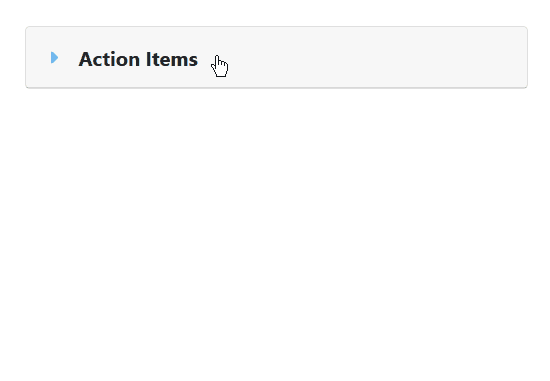
- Built an accordion-based layout using Bootstrap and Angular to reduce on-screen clutter and keep users focused.
- Inserted subtle confirmation messages and made sure button language matched user intent.
These weren’t flashy changes, but they made the app feel like it was working with the user instead of against them.
What I Learned
This was the project that made me care about a user's experience.
I didn’t have Figma or formal research sessions, I had production bugs, angry users, and a short timeline. But in that environment, I learned the value of thoughtful defaults, visual hierarchy, and designing for clarity.
I stopped coding for functionality, and started coding for trust.
That mindset shift has guided me ever since.
Reflection
This project didn’t start with a design system, but it helped me understand why they matter.
In the absence of formal UX tooling, I leaned on consistency, semantic patterns, and reusability to reduce user confusion. That foundation later evolved into my work designing reusable components and contributing to modern design systems in other federal projects.
It’s also where I learned that UX isn’t always about fancy prototypes, it can just be a thoughtful accordion.
It’s also where I learned that UX isn’t always about fancy prototypes, it can just be a thoughtful accordion.