How might we help drivers customize route suggestions?
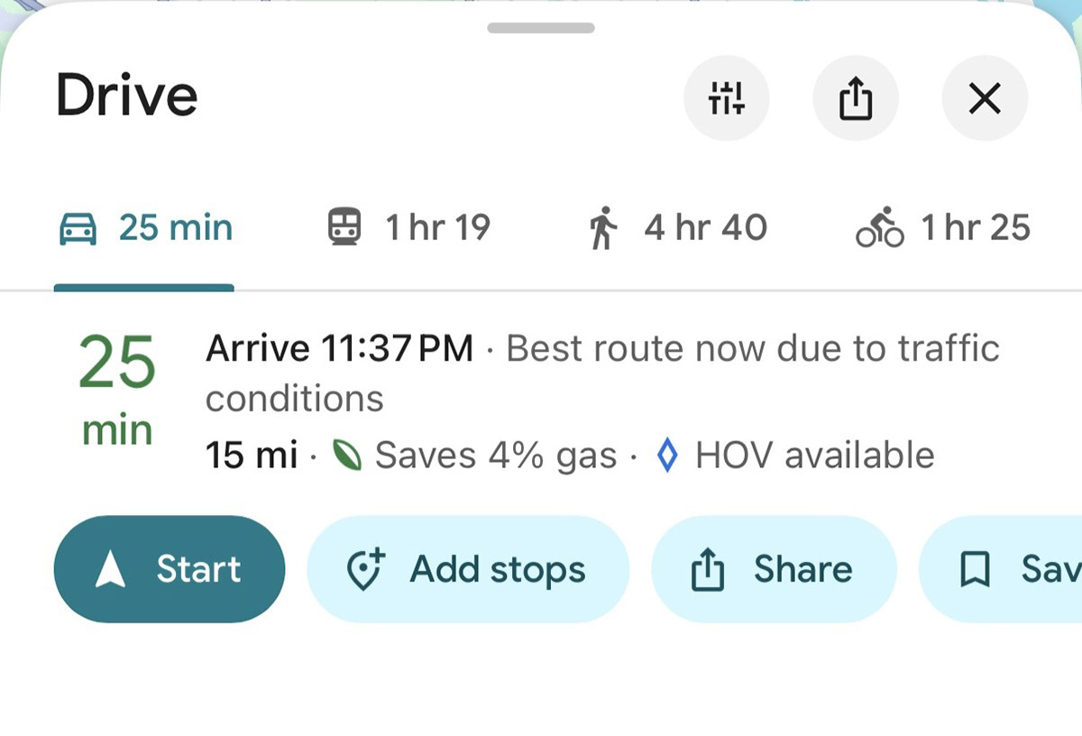
Planning a Route
User-Preferred Routes is a concept that explores giving Google Maps users control over how they're routed, letting them save a preferred route and have it surfaced automatically on future journeys.
Project Length:
8 Weeks
Roles:
Research: Proto-Personas, Problem Statements, User Journey Maps, Usability Studies
Design: Low, Mid, and High Fidelity Mockups, Interactive Prototyping
Goal
Design a navigation experience that helps drivers quickly understand, compare, and choose routes based on their personal preferences.
Proto-Personas
Without access to formal user research, I developed two proto-personas grounded in common real-world routing behaviors - a daily commuter prioritizing familiarity and safety, and a driver who navigates for others and values personal route preferences.
Jay: The Work Commuter.
"I want to be guided on a safe and familiar road, so I can be comfortable driving at night"
"I want to be guided on a safe and familiar road, so I can be comfortable driving at night"
Rachel: The Ride-giving driver.
"I want to save personal routes, so I can navigate with my preferences."
"I want to save personal routes, so I can navigate with my preferences."
Design Process

Starting from sketches, I moved through low, mid, and high fidelity wireframes - running usability tests at both the mid and high fidelity stages and iterating between them.
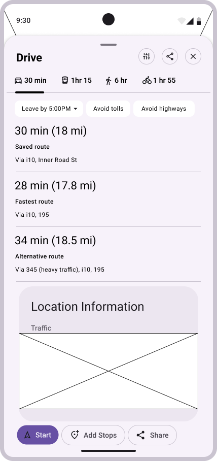
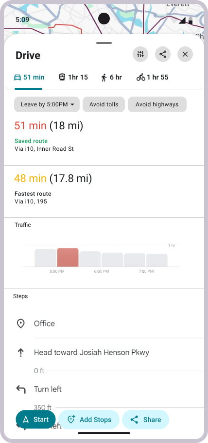
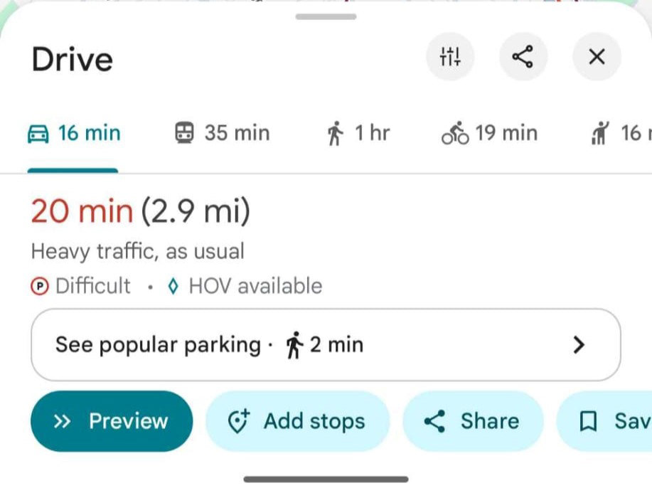
Early wireframes established the core decisions: the saved route should appear first in the route list, above the fastest and alternative options. That hierarchy stayed consistent through every iteration.
Early wireframes established the core decisions: the saved route should appear first in the route list, above the fastest and alternative options. That hierarchy stayed consistent through every iteration.
Usability Testing
Testing the mid-fidelity prototype with participants surfaced three clear findings.
1. Users wanted the app to learn their habits automatically - recognizing roads they take regularly and surfacing suggestions based on real behavior over time, rather than requiring manual action.
"You've taken this route 90% of the time."
"You've taken this route 90% of the time."
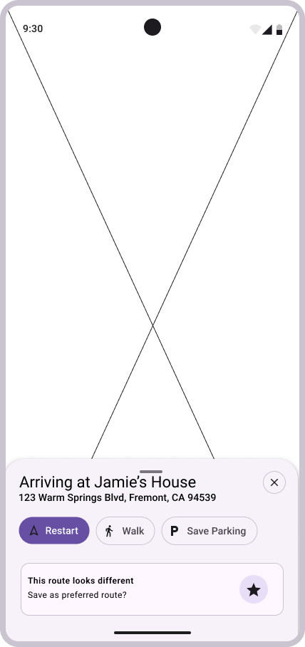
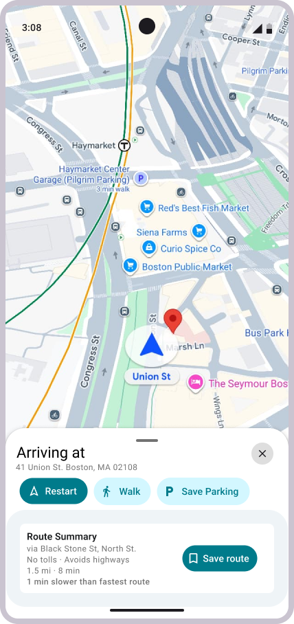
2. The save route feature wasn't visible enough. The prompt at arrival wasn't drawing attention - one participant noted it looked "ignorable". The feature needed more presence.
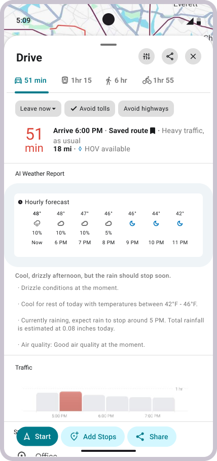
3. Participants also wanted more context before committing to a route. Weather came up as a specific example.
"It would be cool to see what the general weather looks like."
"It would be cool to see what the general weather looks like."
Final Designs

Two things shifted from MidFi to HiFi:
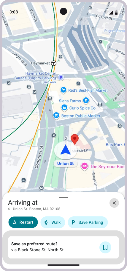
A "Route Summary" was made, both as a visibility and contextual solution based on the Usability Test Findings.
A weather widget was added to the route detail panel, a direct response to what participants asked for during testing. I happened to like that idea, and wanted to see how it would pan out!
Lessons Learned
Consistency across devices is not guaranteed, even in production.
Features visible on one device weren't available on another. What I could see and test, participants sometimes couldn't. That inconsistency made usability testing harder to control and highlighted something easy to overlook — even mature, widely-used products have surface area that isn't uniform across their user base.
Designing a live product means your reference is always moving.
Google shipped updates throughout this project that affected the design directly. Screens changed, features shifted, and what existed in production one week didn't always match the next. Designing within a large, actively evolving system means building tolerance for a moving target - and learning to document your reference point carefully.
Google shipped updates throughout this project that affected the design directly. Screens changed, features shifted, and what existed in production one week didn't always match the next. Designing within a large, actively evolving system means building tolerance for a moving target - and learning to document your reference point carefully.
Knowing when to follow the user is harder than it sounds.
Usability testing is supposed to surface what users need - but deciding what to act on requires judgment. The weather widget came directly from participant feedback and made the design stronger. But it also raised a real question: am I improving the core feature, or chasing adjacent ones? That balance doesn't have a clean answer, and learning to sit with that ambiguity is part of the process.
Usability testing is supposed to surface what users need - but deciding what to act on requires judgment. The weather widget came directly from participant feedback and made the design stronger. But it also raised a real question: am I improving the core feature, or chasing adjacent ones? That balance doesn't have a clean answer, and learning to sit with that ambiguity is part of the process.
What's Next?
1. Iterate on the prototype using feedback from the second usability study to further tighten the current design. There's still room to refine the save interaction and route visibility before this is truly resolved.
2. Integrate saved routes with the "You" page in Google Maps. That's where personalization already lives in the product. It's the natural home for named, user-defined routes, and would let people label a route something meaningful to them rather than just a street address.
3. Build the Android Auto version of the prototype. The driving context is where this feature matters most, and the Auto experience is the next logical platform to design and test on — a smaller screen, a hands-free interaction model, and a user who really can't afford friction.