How might we create a simple, safe entry point for newcomers to join local sports groups, so they feel comfortable participating without connections?
Community Kickoff
TeamReach helps recreational sports groups coordinate events, communicate, and share updates in one place.
It's originally designed as a private sports group coordination tool, but what if it was open to new individuals looking for a group to join? I was tasked to create a case study on this possibility.
Project Length:
1 Month
Roles:
Research: Lightning Demo, Sprint Mapping, User Feedback, Usability Testing.
Design: Low Fidelity Mockups, High Fidelity Mockups, Interactive Prototyping
Research Objective
Goals
Explore how recreational athletes use private communication tools like TeamReach to coordinate games, share updates, maintain their sports communities, and identify how these systems could evolve to support discovery and inclusion for new or casual players.
Understand what motivates recreational players to join, stay, or leave sports groups.
Examine how trust and familiarity shape participation in private vs open communities.
Determine how current coordination habits (group codes, chats, text threads) affect accessibility for new players.
Sprint Map
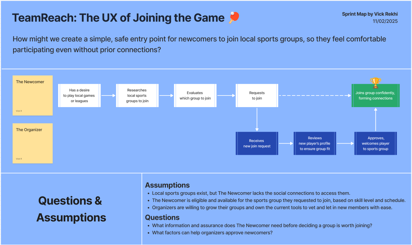
A sprint map was created to detail an ideal user process.
Principles & Related Worlds
To capture the idea of what kind of design I wanted to make, I wanted to draw out what themes to communicate, along with similar projects that already accomplish them respectively.
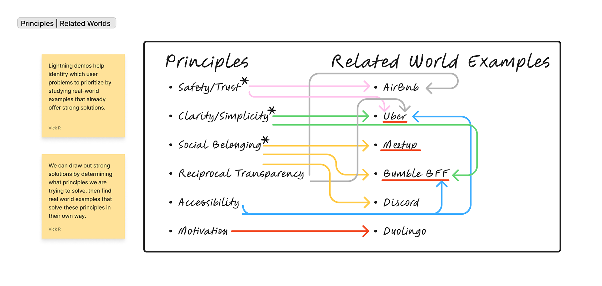
Some related world examples accomplish multiple principles. I noted those to expand further under lightning sketches
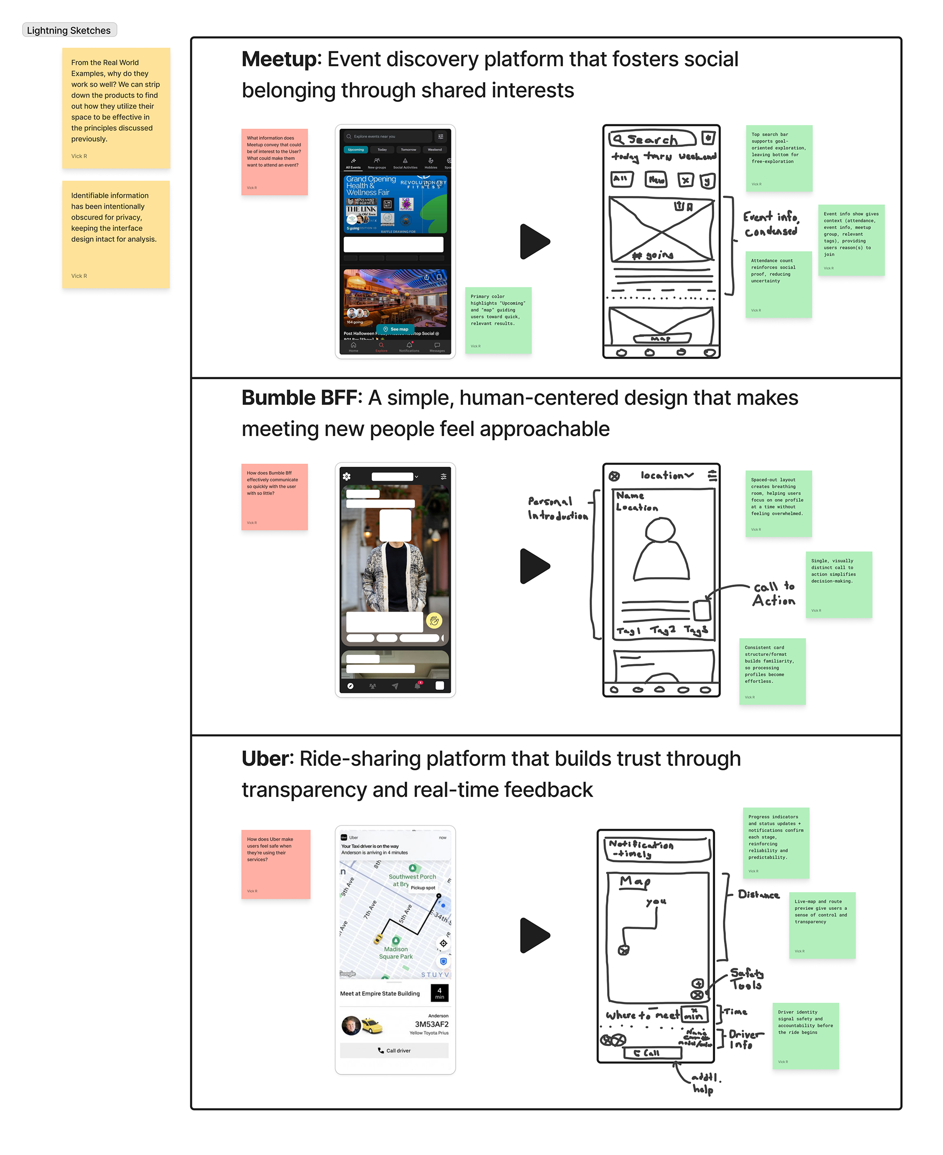
Lightning Sketches
After shortlisting some applications, I broke down their production version into Lo-Fi wireframes, helping me note and reason some justifications behind those decisions.
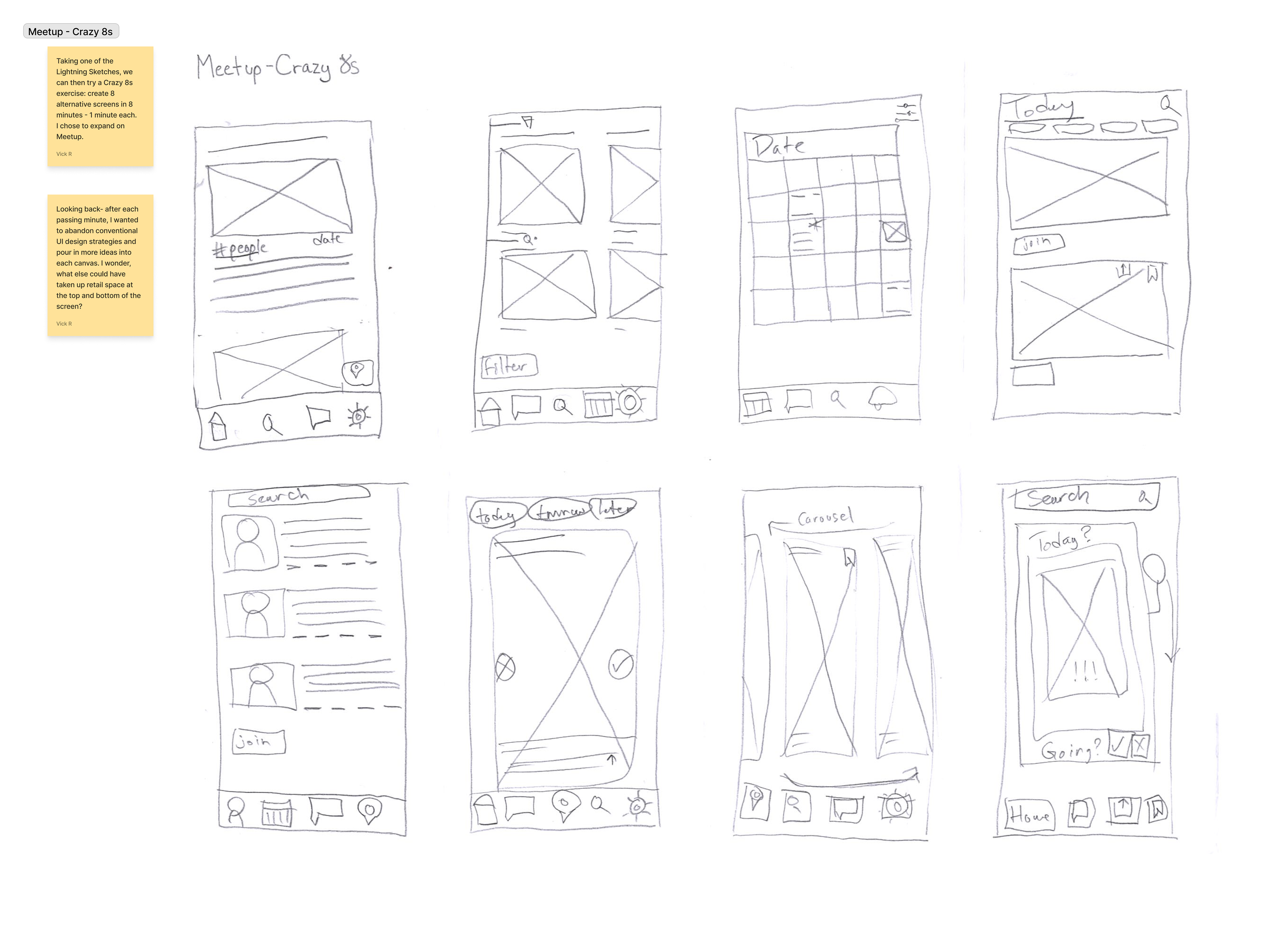
Crazy 8s
I further shortlisted Meetup to create an opportunity to work on a crazy 8s exercise (1 minute, one sketch). If I could redo Meetup, how would I perform that? This was the final step I took before creating my first LoFi Design.
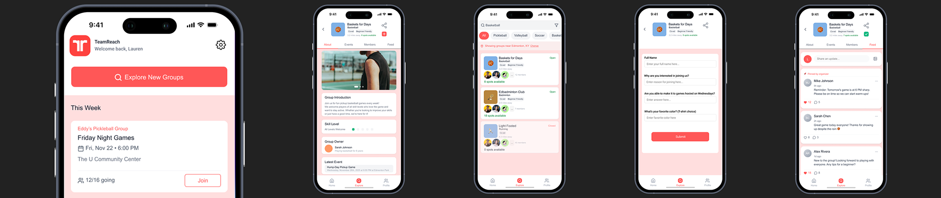
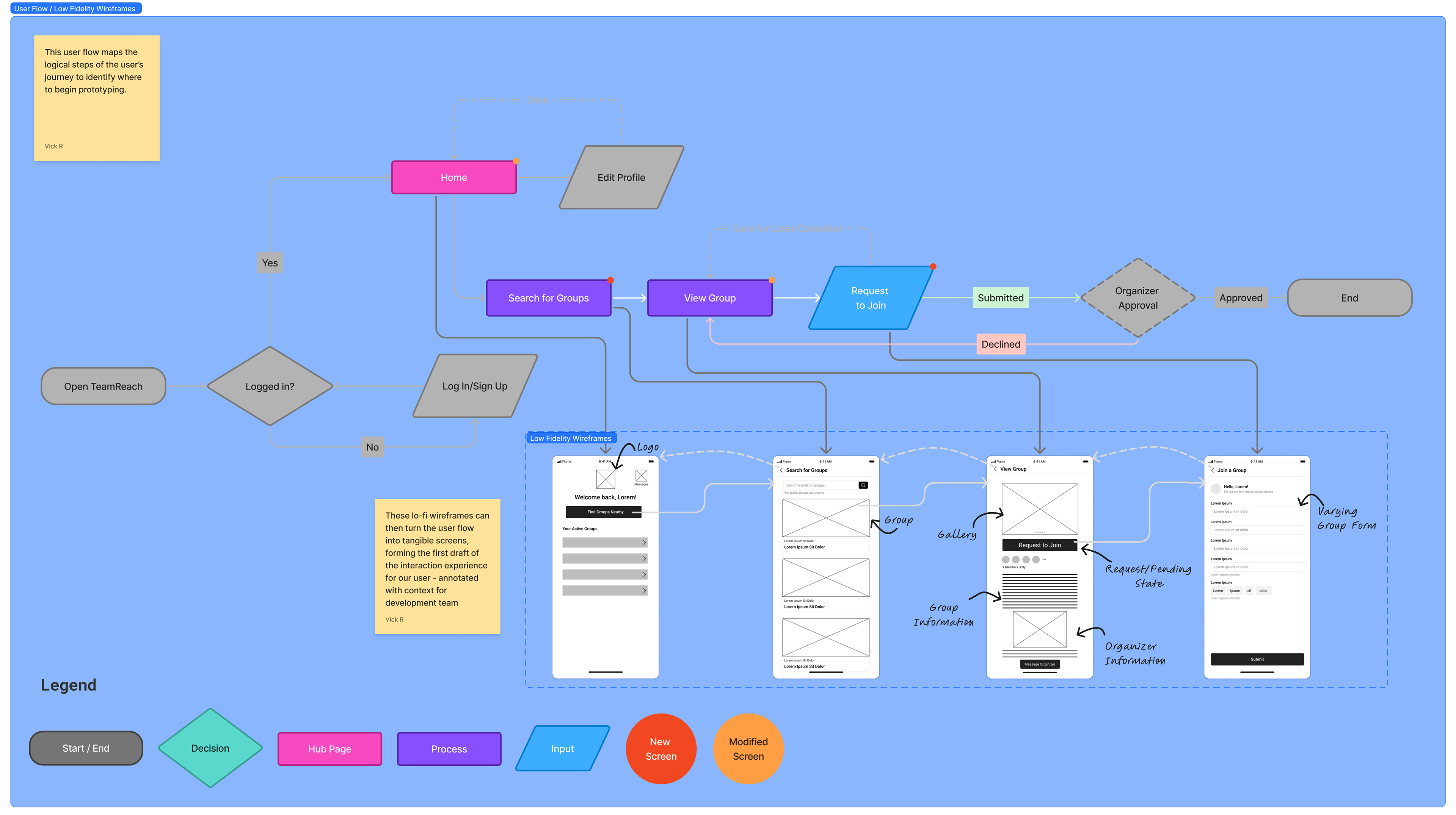
User Flow & LoFi Mockups
After converting the Sprint Map to a User Flow, I created Low Fidelity wireframes to associate to each process.
High Fidelity Prototype: First Draft
Iterating on the Low Fidelity wireframes, the first High Fidelity Prototype was created.
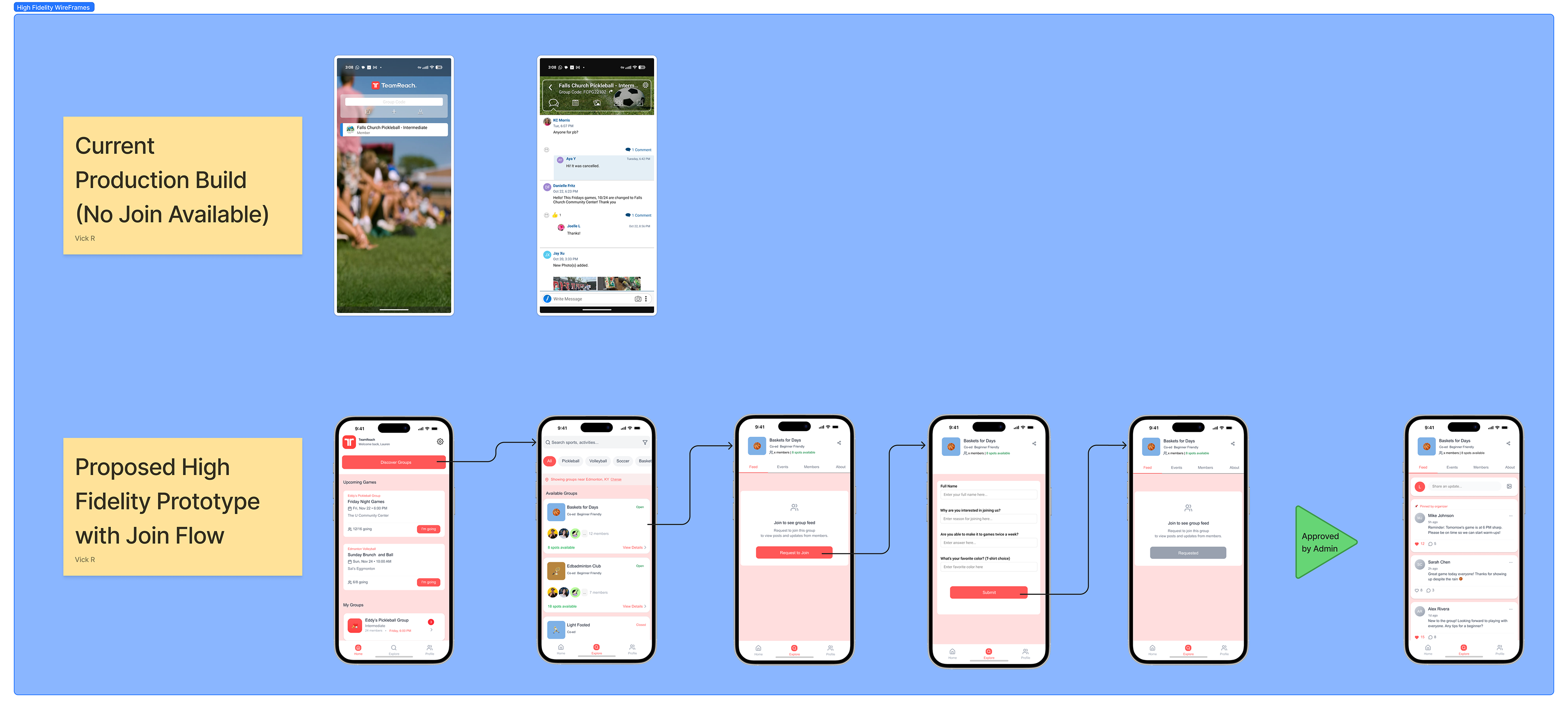
Interactive Prototype (First Draft):
Usability Testing
- 30-45 minute usability test interviews.
- 6 Recreational Athletes interviewed 12/02/2025 - 12/04/2025.
- Location: In-person at pickleball court, remote through Zoom.
Results:
Results:
- Visual Hierarchy, UI, and process states were clean and easy to understand, but Typography and Call to Actions needed improvement.
- Sports search process was seamless and group tabs were organized, but uncertainty arose when group information was unavailable to non-members.
Updated Prototype (2nd Draft)
Lessons Learned
What Next?
1. Information Hierarchy is critical for decision confidence - Placing the right details early dramatically shaped user behavior positively.
2. Prioritize clarity over elegant interaction - Simplifying the flow helped users make decisions faster and with more confidence.
3. Users always need more context than you think - Assumptions about “minimalism” often conflict with real user needs.
Future iterations would include re-testing the updated prototype to validate improvements and identify remaining usability issues.
Additional opportunities, including an introduction to social and messaging flows once users join groups, can further help address comfort in groups they’ve joined.
Additional opportunities, including an introduction to social and messaging flows once users join groups, can further help address comfort in groups they’ve joined.